What are Webhooks?
Webhooks are a way that applications can send automated messages or data to other applications. Applications can talk to each other one of two ways, with polling or with webhooks. As webhooks service Zapier puts it:
Polling is like knocking on your friend’s door and asking if they have any sugar. Webhooks are like someone tossing a bag of sugar at your house whenever they buy some.
Exercise
Create a custom email that includes a summary of a customers order, that will be sent as a receipt after an order is placed.
Prerequisites
- Create a free account with Zapier
- Navigate to the July Office Hours Space
- Copy the Order Confirmation Details Look into your personal space
- Edit the copied Look, and change the email field and user name to your own email and name. Save the Look
Sending a Custom Email Through Zapier
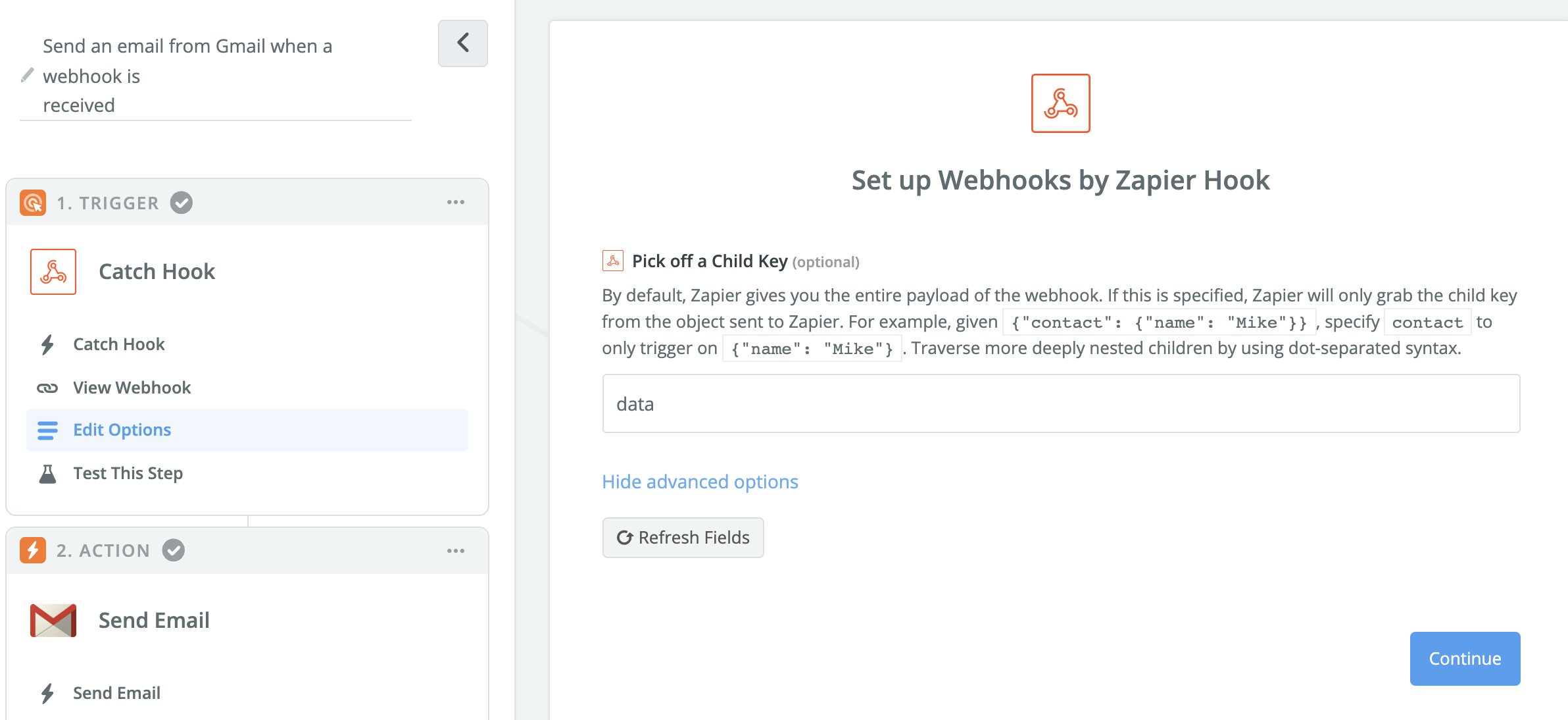
1. Create a Zap between a webhook and Gmail

2. In Looker, schedule a Look to that webhook in the JSON — Simple, Inline format
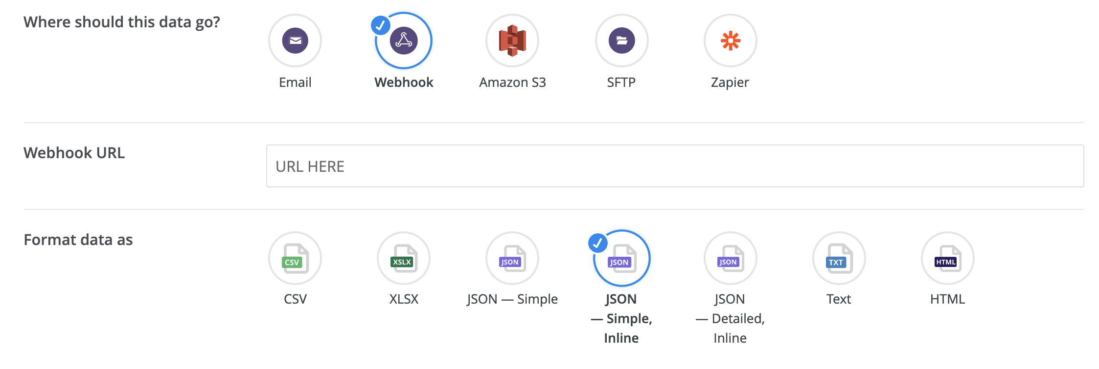
3. Under Edit Options, input “data”
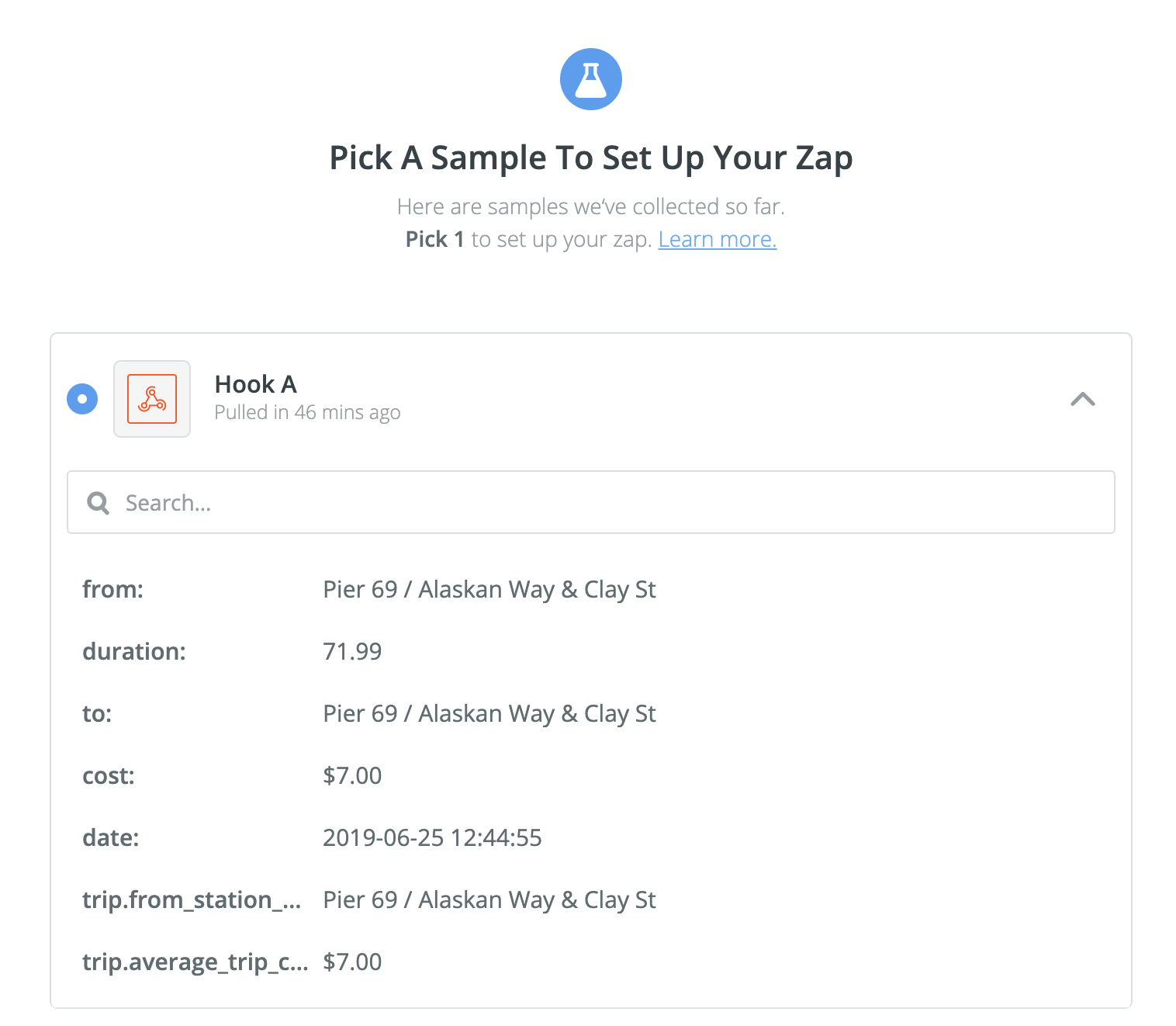
4. In Looker, send a test. In Zapier, test this step.
5. In the Set Up Template page, use the drop down menu next to the To option to input the variable for user email.
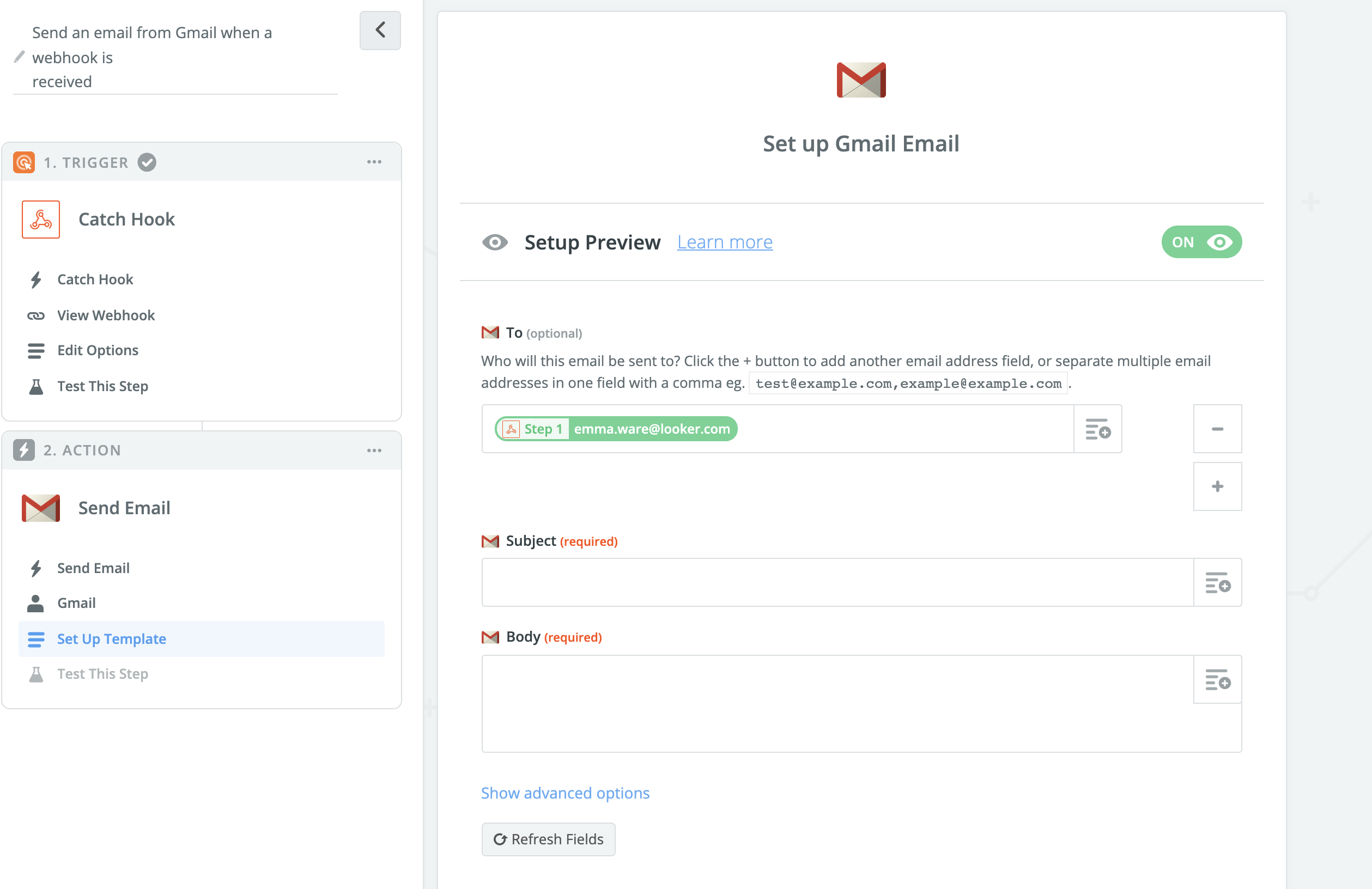
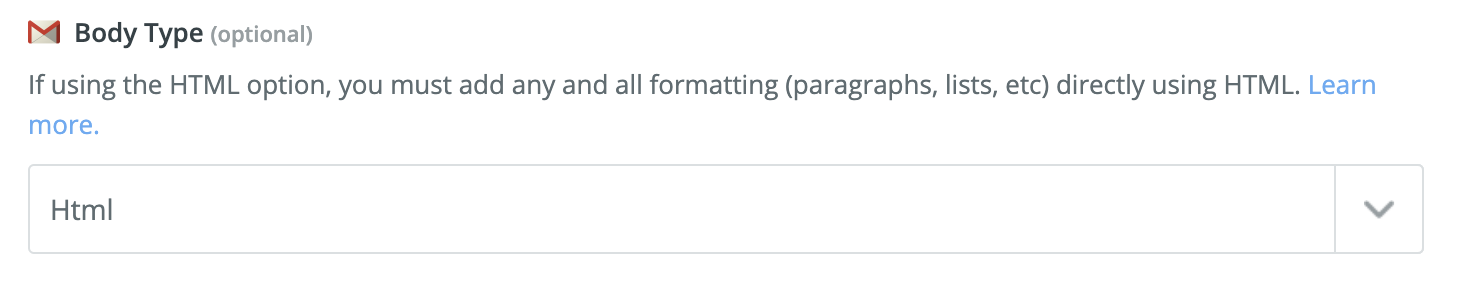
6. Edit the template to be an html Body Type
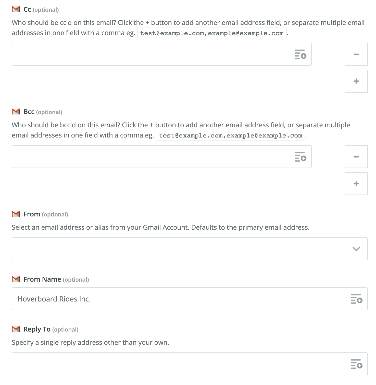
7. If desired, edit From, From Name, and other fields
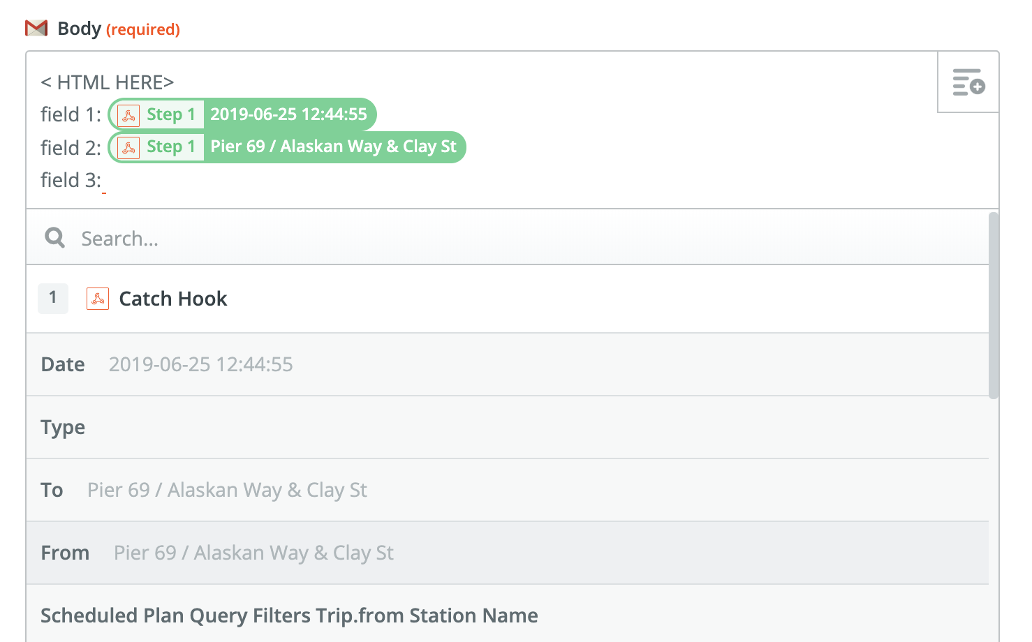
8. Input desired html in the Body, and add specific data points when appropriate using the drop down menu.
We've created a sample email template, found below.
<!DOCTYPE html PUBLIC "-//W3C//DTD XHTML 1.0 Transitional //EN" "http://www.w3.org/TR/xhtml1/DTD/xhtml1-transitional.dtd">

<html xmlns="http://www.w3.org/1999/xhtml" xmlns:o="urn:schemas-microsoft-com:office:office" xmlns:v="urn:schemas-microsoft-com:vml">
<head>

<meta content="text/html; charset=utf-8" http-equiv="Content-Type"/>
<meta content="width=device-width" name="viewport"/>

<meta content="IE=edge" http-equiv="X-UA-Compatible"/>

<title></title>

<link href="https://fonts.googleapis.com/css?family=Bitter" rel="stylesheet" type="text/css"/>
<link href="https://fonts.googleapis.com/css?family=Open+Sans" rel="stylesheet" type="text/css"/>

<style type="text/css">
		body {
			margin: 0;
			padding: 0;
		}

		table,
		td,
		tr {
			vertical-align: top;
			border-collapse: collapse;
		}

		 b, strong {
     	color: #134C75;
     	}

		* {
			line-height: inherit;
		}

		a[x-apple-data-detectors=true] {
			color: inherit !important;
			text-decoration: none !important;
		}

		.ie-browser table {
			table-layout: fixed;
		}

		[owa] .img-container div,
		[owa] .img-container button {
			display: block !important;
		}

		[owa] .fullwidth button {
			width: 100% !important;
		}

		[owa] .block-grid .col {
			display: table-cell;
			float: none !important;
			vertical-align: top;
		}

		.ie-browser .block-grid,
		.ie-browser .num12,
		[owa] .num12,
		[owa] .block-grid {
			width: 605px !important;
		}

		.ie-browser .mixed-two-up .num4,
		[owa] .mixed-two-up .num4 {
			width: 200px !important;
		}

		.ie-browser .mixed-two-up .num8,
		[owa] .mixed-two-up .num8 {
			width: 400px !important;
		}

		.ie-browser .block-grid.two-up .col,
		[owa] .block-grid.two-up .col {
			width: 300px !important;
		}

		.ie-browser .block-grid.three-up .col,
		[owa] .block-grid.three-up .col {
			width: 300px !important;
		}

		.ie-browser .block-grid.four-up .col [owa] .block-grid.four-up .col {
			width: 150px !important;
		}

		.ie-browser .block-grid.five-up .col [owa] .block-grid.five-up .col {
			width: 121px !important;
		}

		.ie-browser .block-grid.six-up .col,
		[owa] .block-grid.six-up .col {
			width: 100px !important;
		}

		.ie-browser .block-grid.seven-up .col,
		[owa] .block-grid.seven-up .col {
			width: 86px !important;
		}

		.ie-browser .block-grid.eight-up .col,
		[owa] .block-grid.eight-up .col {
			width: 75px !important;
		}

		.ie-browser .block-grid.nine-up .col,
		[owa] .block-grid.nine-up .col {
			width: 67px !important;
		}

		.ie-browser .block-grid.ten-up .col,
		[owa] .block-grid.ten-up .col {
			width: 60px !important;
		}

		.ie-browser .block-grid.eleven-up .col,
		[owa] .block-grid.eleven-up .col {
			width: 54px !important;
		}

		.ie-browser .block-grid.twelve-up .col,
		[owa] .block-grid.twelve-up .col {
			width: 50px !important;
		}
	</style>
<style id="media-query" type="text/css">
		@media only screen and (min-width: 625px) {
			.block-grid {
				width: 605px !important;
			}

			.block-grid .col {
				vertical-align: top;
			}

			.block-grid .col.num12 {
				width: 605px !important;
			}

			.block-grid.mixed-two-up .col.num3 {
				width: 150px !important;
			}

			.block-grid.mixed-two-up .col.num4 {
				width: 200px !important;
			}

			.block-grid.mixed-two-up .col.num8 {
				width: 400px !important;
			}

			.block-grid.mixed-two-up .col.num9 {
				width: 450px !important;
			}

			.block-grid.two-up .col {
				width: 302px !important;
			}

			.block-grid.three-up .col {
				width: 201px !important;
			}

			.block-grid.four-up .col {
				width: 151px !important;
			}

			.block-grid.five-up .col {
				width: 121px !important;
			}

			.block-grid.six-up .col {
				width: 100px !important;
			}

			.block-grid.seven-up .col {
				width: 86px !important;
			}

			.block-grid.eight-up .col {
				width: 75px !important;
			}

			.block-grid.nine-up .col {
				width: 67px !important;
			}

			.block-grid.ten-up .col {
				width: 60px !important;
			}

			.block-grid.eleven-up .col {
				width: 55px !important;
			}

			.block-grid.twelve-up .col {
				width: 50px !important;
			}
		}

		@media (max-width: 625px) {

			.block-grid,
			.col {
				min-width: 320px !important;
				max-width: 100% !important;
				display: block !important;
			}

			.block-grid {
				width: 100% !important;
			}

			.col {
				width: 100% !important;
			}

			.col>div {
				margin: 0 auto;
			}

			img.fullwidth,
			img.fullwidthOnMobile {
				max-width: 100% !important;
			}

			.no-stack .col {
				min-width: 0 !important;
				display: table-cell !important;
			}

			.no-stack.two-up .col {
				width: 50% !important;
			}

			.no-stack .col.num4 {
				width: 33% !important;
			}

			.no-stack .col.num8 {
				width: 66% !important;
			}

			.no-stack .col.num4 {
				width: 33% !important;
			}

			.no-stack .col.num3 {
				width: 25% !important;
			}

			.no-stack .col.num6 {
				width: 50% !important;
			}

			.no-stack .col.num9 {
				width: 75% !important;
			}

			.video-block {
				max-width: none !important;
			}

			.mobile_hide {
				min-height: 0px;
				max-height: 0px;
				max-width: 0px;
				display: none;
				overflow: hidden;
				font-size: 0px;
			}

			.desktop_hide {
				display: block !important;
				max-height: none !important;
			}
		}
	</style>
</head>
<body class="clean-body" style="margin: 0; padding: 0; -webkit-text-size-adjust: 100%; background-color: #FFFFFF;">

<table bgcolor="#FFFFFF" cellpadding="0" cellspacing="0" class="nl-container" role="presentation" style="table-layout: fixed; vertical-align: top; min-width: 320px; Margin: 0 auto; border-spacing: 0; border-collapse: collapse; mso-table-lspace: 0pt; mso-table-rspace: 0pt; background-color: #FFFFFF; width: 100%;" valign="top" width="100%">
<tbody>
<tr style="vertical-align: top;" valign="top">
<td style="word-break: break-word; vertical-align: top; border-collapse: collapse;" valign="top">

<div style="background-color:#49a6e8;">
<div class="block-grid" data-body-width-father="605px" rel="col-num-container-box-father" style="Margin: 0 auto; min-width: 320px; max-width: 605px; overflow-wrap: break-word; word-wrap: break-word; word-break: break-word; background-color: transparent;">
<div style="border-collapse: collapse;display: table;width: 100%;background-color:transparent;">

<div class="col num12" data-body-width-son="605" rel="col-num-container-box-son" style="min-width: 320px; max-width: 605px; display: table-cell; vertical-align: top;">
<div style="width:100% !important;">

<div style="border-top:0px solid transparent; border-left:0px solid transparent; border-bottom:0px solid transparent; border-right:0px solid transparent; padding-top:0px; padding-bottom:0px; padding-right: 0px; padding-left: 0px;">

<table border="0" cellpadding="0" cellspacing="0" class="divider" role="presentation" style="table-layout: fixed; vertical-align: top; border-spacing: 0; border-collapse: collapse; mso-table-lspace: 0pt; mso-table-rspace: 0pt; min-width: 100%; -ms-text-size-adjust: 100%; -webkit-text-size-adjust: 100%;" valign="top" width="100%">
<tbody>
<tr style="vertical-align: top;" valign="top">
<td class="divider_inner" style="word-break: break-word; vertical-align: top; min-width: 100%; -ms-text-size-adjust: 100%; -webkit-text-size-adjust: 100%; padding-top: 20px; padding-right: 20px; padding-bottom: 20px; padding-left: 20px; border-collapse: collapse;" valign="top">
<table align="center" border="0" cellpadding="0" cellspacing="0" class="divider_content" role="presentation" style="table-layout: fixed; vertical-align: top; border-spacing: 0; border-collapse: collapse; mso-table-lspace: 0pt; mso-table-rspace: 0pt; width: 100%; border-top: 0px solid transparent;" valign="top" width="100%">
<tbody>
<tr style="vertical-align: top;" valign="top">
<td style="word-break: break-word; vertical-align: top; -ms-text-size-adjust: 100%; -webkit-text-size-adjust: 100%; border-collapse: collapse;" valign="top"><span></span></td>
</tr>
</tbody>
</table>
</td>
</tr>
</tbody>
</table>
<div align="center" class="img-container center autowidth" style="padding-right: 0px;padding-left: 0px;">
<a href="http://example.com" target="_blank"> <img align="center" alt="Image" border="0" class="center autowidth" src="https://image.flaticon.com/icons/svg/1028/1028537.svg" style="outline: none; text-decoration: none; -ms-interpolation-mode: bicubic; clear: both; height: auto; float: none; border: none; width: 100%; max-width: 150px; display: block;" title="Image" width="150"/></a>

</div>

<div style="color:#FFFFFF;font-family:'Bitter', Georgia, Times, 'Times New Roman', serif;line-height:120%;padding-top:20px;padding-right:10px;padding-bottom:10px;padding-left:10px;">
<div style="font-size: 12px; line-height: 14px; font-family: 'Bitter', Georgia, Times, 'Times New Roman', serif; color: #FFFFFF;">
<p style="font-size: 14px; line-height: 33px; text-align: center; margin: 0;"><span mce-data-marked="1" style="font-size: 28px;">Fabios Fabulous Fashions</span></p>
</div>
</div>

<div style="color:#acd6f4;font-family:'Open Sans', Helvetica, Arial, sans-serif;line-height:150%;padding-top:10px;padding-right:10px;padding-bottom:10px;padding-left:10px;">
<div style="font-size: 12px; line-height: 18px; font-family: 'Open Sans', Helvetica, Arial, sans-serif; color: #acd6f4;">
<p style="font-size: 14px; line-height: 21px; text-align: center; margin: 0;"><span style="font-size: 14px; line-height: 21px;"></span></p>
<p style="font-size: 12px; line-height: 21px; text-align: center; margin: 0;"><span style="font-size: 14px;"></span></p>
</div>
</div>

</div>

</div>
</div>

</div>
</div>
</div>
<div style="background-color:#f3f3f3;">
<div class="block-grid" data-body-width-father="605px" rel="col-num-container-box-father" style="Margin: 0 auto; min-width: 320px; max-width: 605px; overflow-wrap: break-word; word-wrap: break-word; word-break: break-word; background-color: transparent;">
<div style="border-collapse: collapse;display: table;width: 100%;background-color:transparent;">

<div class="col num12" data-body-width-son="605" rel="col-num-container-box-son" style="min-width: 320px; max-width: 605px; display: table-cell; vertical-align: top;">
<div style="width:100% !important;">

<div style="border-top:0px solid transparent; border-left:0px solid transparent; border-bottom:0px solid transparent; border-right:0px solid transparent; padding-top:0px; padding-bottom:0px; padding-right: 0px; padding-left: 0px;">

<table border="0" cellpadding="0" cellspacing="0" class="divider" role="presentation" style="table-layout: fixed; vertical-align: top; border-spacing: 0; border-collapse: collapse; mso-table-lspace: 0pt; mso-table-rspace: 0pt; min-width: 100%; -ms-text-size-adjust: 100%; -webkit-text-size-adjust: 100%;" valign="top" width="100%">
<tbody>
<tr style="vertical-align: top;" valign="top">
<td class="divider_inner" style="word-break: break-word; vertical-align: top; min-width: 100%; -ms-text-size-adjust: 100%; -webkit-text-size-adjust: 100%; padding-top: 25px; padding-right: 25px; padding-bottom: 25px; padding-left: 25px; border-collapse: collapse;" valign="top">
<table align="center" border="0" cellpadding="0" cellspacing="0" class="divider_content" role="presentation" style="table-layout: fixed; vertical-align: top; border-spacing: 0; border-collapse: collapse; mso-table-lspace: 0pt; mso-table-rspace: 0pt; width: 100%; border-top: 0px solid transparent;" valign="top" width="100%">
<tbody>
<tr style="vertical-align: top;" valign="top">
<td style="word-break: break-word; vertical-align: top; -ms-text-size-adjust: 100%; -webkit-text-size-adjust: 100%; border-collapse: collapse;" valign="top"><span></span></td>
</tr>
</tbody>
</table>
</td>
</tr>
</tbody>
</table>

</div>

</div>
</div>

</div>
</div>
</div>
<div style="background-color:#f3f3f3;">
<div class="block-grid" data-body-width-father="800px" rel="col-num-container-box-father" style="Margin: 0 auto; min-width: 320px; max-width: 800px; overflow-wrap: break-word; word-wrap: break-word; word-break: break-word; background-color: transparent;">
<div style="border-collapse: collapse;display: table;width: 100%;background-color:transparent;">

<div class="col num12" data-body-width-son="605" rel="col-num-container-box-son" style="min-width: 320px; max-width: 800px; display: table-cell; vertical-align: top;">
<div style="width:100% !important;">

<div style="border-top:0px solid transparent; border-left:0px solid transparent; border-bottom:0px solid transparent; border-right:0px solid transparent; padding-top:5px; padding-bottom:5px; padding-right: 0px; padding-left: 0px;">

<div style="color:#134C75;font-family:'Bitter', Georgia, Times, 'Times New Roman', serif;line-height:120%;padding-top:10px;padding-right:10px;padding-bottom:10px;padding-left:10px;">
<div style="font-size: 12px; line-height: 14px; font-family: 'Bitter', Georgia, Times, 'Times New Roman', serif; color: #134C75;">
<p style="font-size: 14px; line-height: 16px; margin: 0;"><strong><span style="font-size: 28px; line-height: 33px;">Thank you for your purchase!</span></strong><br/></p>
</div>
</div>

<div style="color:#555555;font-family:'Open Sans', Helvetica, Arial, sans-serif;line-height:150%;padding-top:10px;padding-right:10px;padding-bottom:10px;padding-left:10px;">
<div style="font-size: 12px; line-height: 18px; font-family: 'Open Sans', Helvetica, Arial, sans-serif; color: #555555;">
<p style="font-size: 14px; line-height: 21px; margin: 0;">We are so happy you choose Fabios Fabulous Fashions for your stylish threads! We hope you had a pleasant experience and are getting excited about your sweet new duds. Here is a summary of your purchase.</p>
</div>
</div>

<table border="0" cellpadding="0" cellspacing="0" class="divider" role="presentation" style="table-layout: fixed; vertical-align: top; border-spacing: 0; border-collapse: collapse; mso-table-lspace: 0pt; mso-table-rspace: 0pt; min-width: 100%; -ms-text-size-adjust: 100%; -webkit-text-size-adjust: 100%;" valign="top" width="100%">
<tbody>
<tr style="vertical-align: top;" valign="top">
<td class="divider_inner" style="word-break: break-word; vertical-align: top; min-width: 100%; -ms-text-size-adjust: 100%; -webkit-text-size-adjust: 100%; padding-top: 30px; padding-right: 10px; padding-bottom: 30px; padding-left: 10px; border-collapse: collapse;" valign="top">
<table align="center" border="0" cellpadding="0" cellspacing="0" class="divider_content" role="presentation" style="table-layout: fixed; vertical-align: top; border-spacing: 0; border-collapse: collapse; mso-table-lspace: 0pt; mso-table-rspace: 0pt; width: 100%; border-top: 1px solid #DDDDDD;" valign="top" width="100%">
<tbody>
<tr style="vertical-align: top;" valign="top">
<td style="word-break: break-word; vertical-align: top; -ms-text-size-adjust: 100%; -webkit-text-size-adjust: 100%; border-collapse: collapse;" valign="top"><span></span></td>
</tr>
</tbody>
</table>
</td>
</tr>
</tbody>
</table>
<div style="color:#555555;font-family:'Bitter', Georgia, Times, 'Times New Roman', sans-serif;line-height:180%;padding-top:10px;padding-right:10px;padding-bottom:10px;padding-left:10px;">
<div style="font-size: 12px; line-height: 41px; font-family: 'Bitter', Georgia, Times, 'Times New Roman', sans-serif; color: #555555;">
<p style="font-size: 28px; line-height: 45px; margin: 0;">

	<b>Date: </b>
	<br/><b>Item: </b>
	<br/><b>Brand: </b>
	<br/><b>Price:  </b>


</p>
</div>
</div>

<table border="0" cellpadding="0" cellspacing="0" class="divider" role="presentation" style="table-layout: fixed; vertical-align: top; border-spacing: 0; border-collapse: collapse; mso-table-lspace: 0pt; mso-table-rspace: 0pt; min-width: 100%; -ms-text-size-adjust: 100%; -webkit-text-size-adjust: 100%;" valign="top" width="100%">
<tbody>
<tr style="vertical-align: top;" valign="top">
<td class="divider_inner" style="word-break: break-word; vertical-align: top; min-width: 100%; -ms-text-size-adjust: 100%; -webkit-text-size-adjust: 100%; padding-top: 25px; padding-right: 25px; padding-bottom: 25px; padding-left: 25px; border-collapse: collapse;" valign="top">
<table align="center" border="0" cellpadding="0" cellspacing="0" class="divider_content" role="presentation" style="table-layout: fixed; vertical-align: top; border-spacing: 0; border-collapse: collapse; mso-table-lspace: 0pt; mso-table-rspace: 0pt; width: 100%; border-top: 0px solid transparent;" valign="top" width="100%">
<tbody>
<tr style="vertical-align: top;" valign="top">
<td style="word-break: break-word; vertical-align: top; -ms-text-size-adjust: 100%; -webkit-text-size-adjust: 100%; border-collapse: collapse;" valign="top"><span></span></td>
</tr>
</tbody>
</table>
</td>
</tr>
</tbody>
</table>

</div>

</div>
</div>

</div>
</div>
</div>

</td>
</tr>
</tbody>
</table>

</body>
</html>